Project
#IamHUGO
To elevate its user experience on their own e-commerce platform HUGO was pushing for innovative approaches on how that could be done. After all, they have much more power to create a branded experience compared to when customers see their products in apps like Zalando.
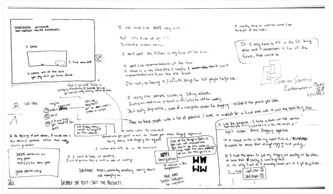
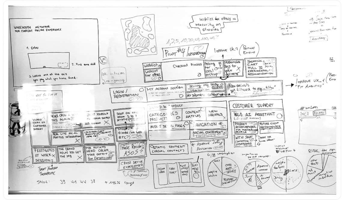
In an intensive user research phase and analysis of internal approaches of the past, the stakeholders concluded to aim for an approach where an AI recommendation system modifies the user experience in real time past what the typical “customers who bought this also bought” has to offer.

User Experience
Research
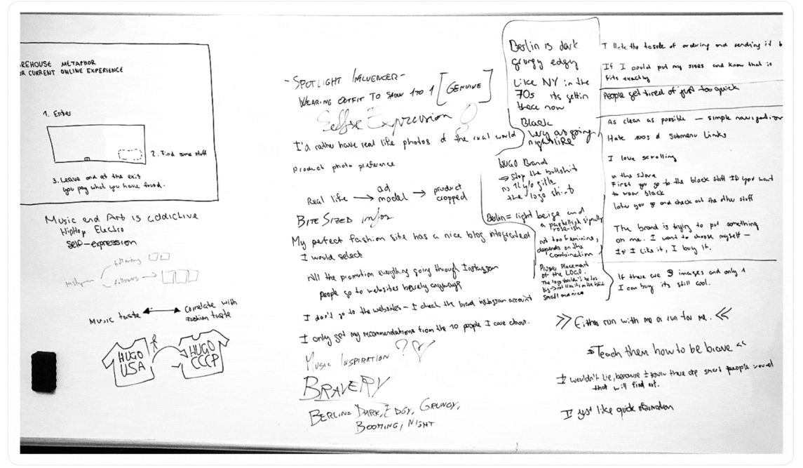
Great tech products are improved in thousands of continuous iterations. Others follow larger cycles of a relaunch. Hugo Bosses e-commerce platform is one of the latter. All knowledge from previous versions is carried forth into the next version, drawing historical data, setting up hypotheses and testing ideas through user interviews where we did plenty.
Strategical
decision making
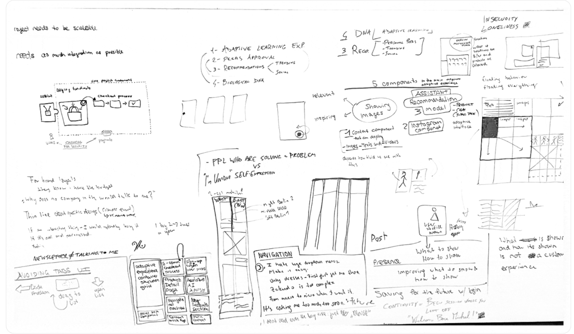
Doctors do x-rays and blood tests to gain insights to make profound decisions and propose plans. With all the information aggregated in our project, we consolidated everything we knew thus far. A strategy was decided. Key was keeping the plan simple and straight forward without mixing different approaches.
Branded
products
One of the hardest interface challenges of all industries lies in consumer products where brands try to create unique branded experiences that are also usable and satisfy UX needs.Brand and UX needs always diverge, demand for compromises. Mastering the challenge of meeting high expectations on both pushes a designers strength to the limits.
The emotional
& rational battle
Excellent UX is a non-creative, purely rational task which only requires lots of data from both machines and humans (And what is human data even?).
Excellent branding is a creative, emotional exercise that requires artistic skill and non-verbal understanding (think of art directors).
You get why companies seperate these in their hierarchies, why brand is often nested into marketing. For some business models such as fashion both have to harmonize to achieve business success.
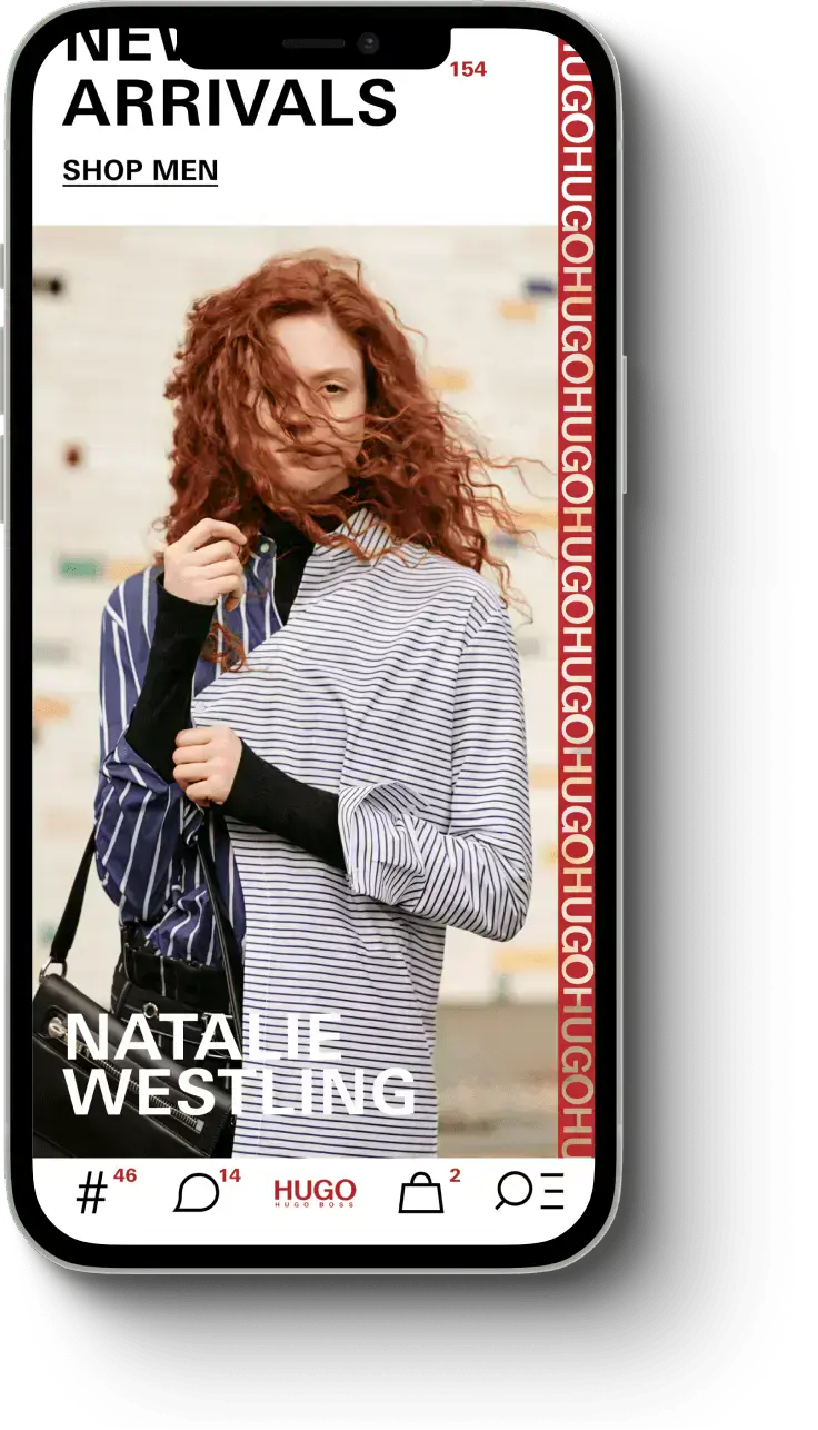
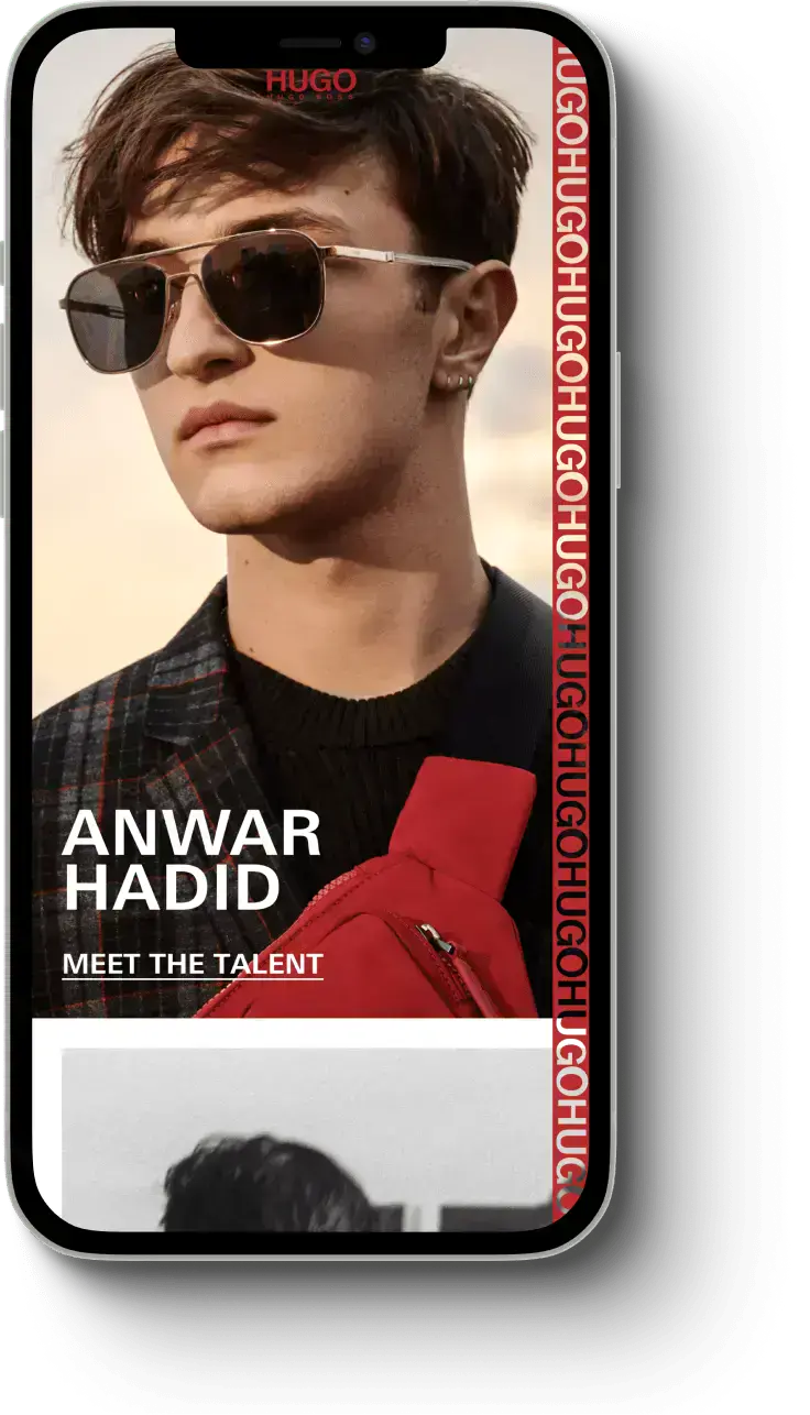


"Daniels bandwidth of capabilities from research and strategical thinking to applied UI/UX design was a key ingredient for the success of the initiative."
Davide Barni
Senior Manager Digital Design at HUGO BOSS
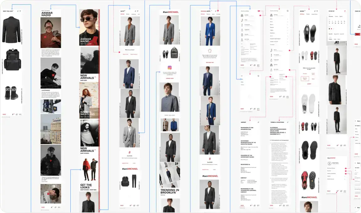
UX flow mapping
Taking a step back, drawing the map – an invention as old as mankind itself.
An intuitive navigation requires a solid concept aligned with a users expectations on where to find certain functions on the one hand.
On the other hand a historical statistical analysis of past actions allows making informed design decisions to decrease prominence of certain features and elevate others for to increase app engagement.